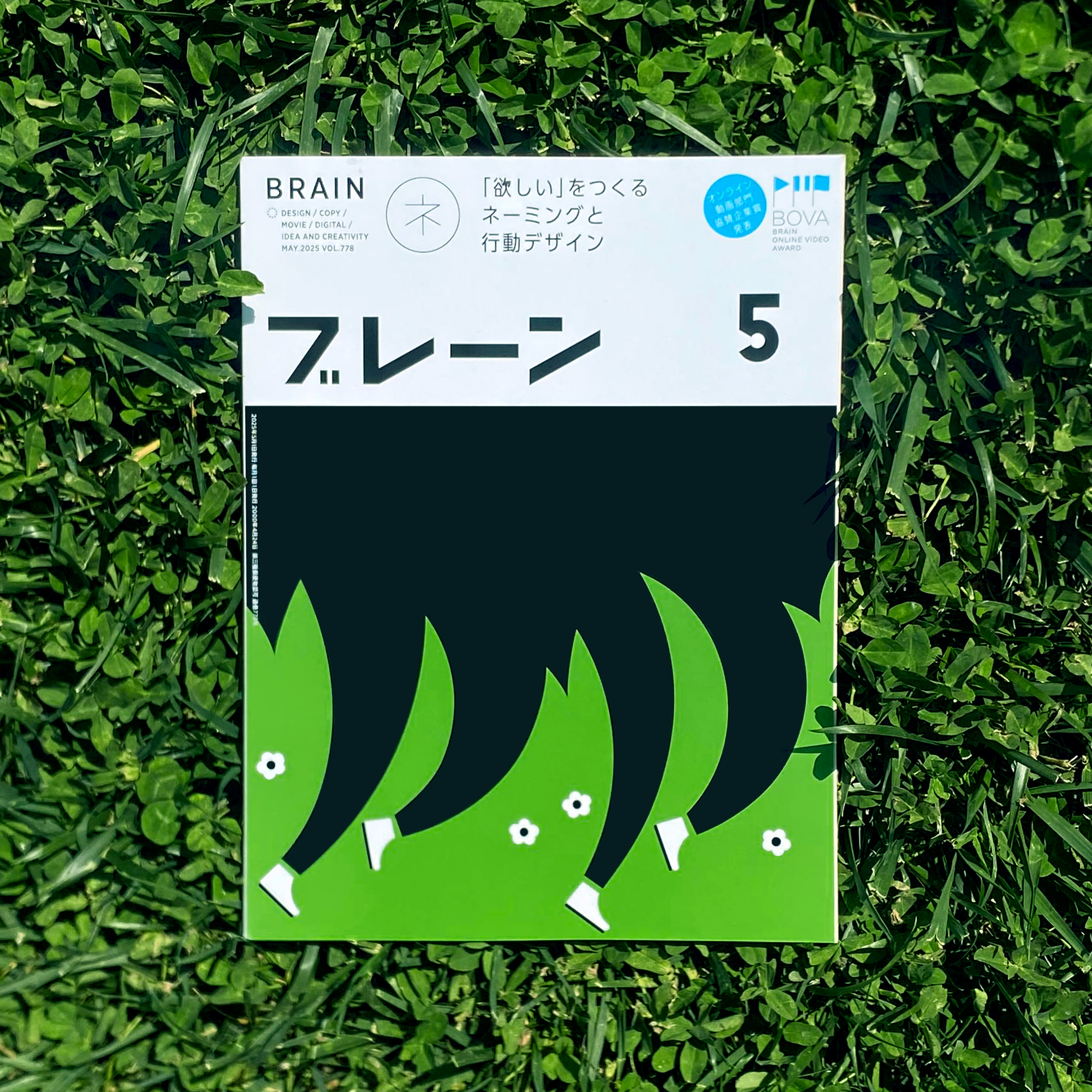

The Spring Issue
Brain Magazine
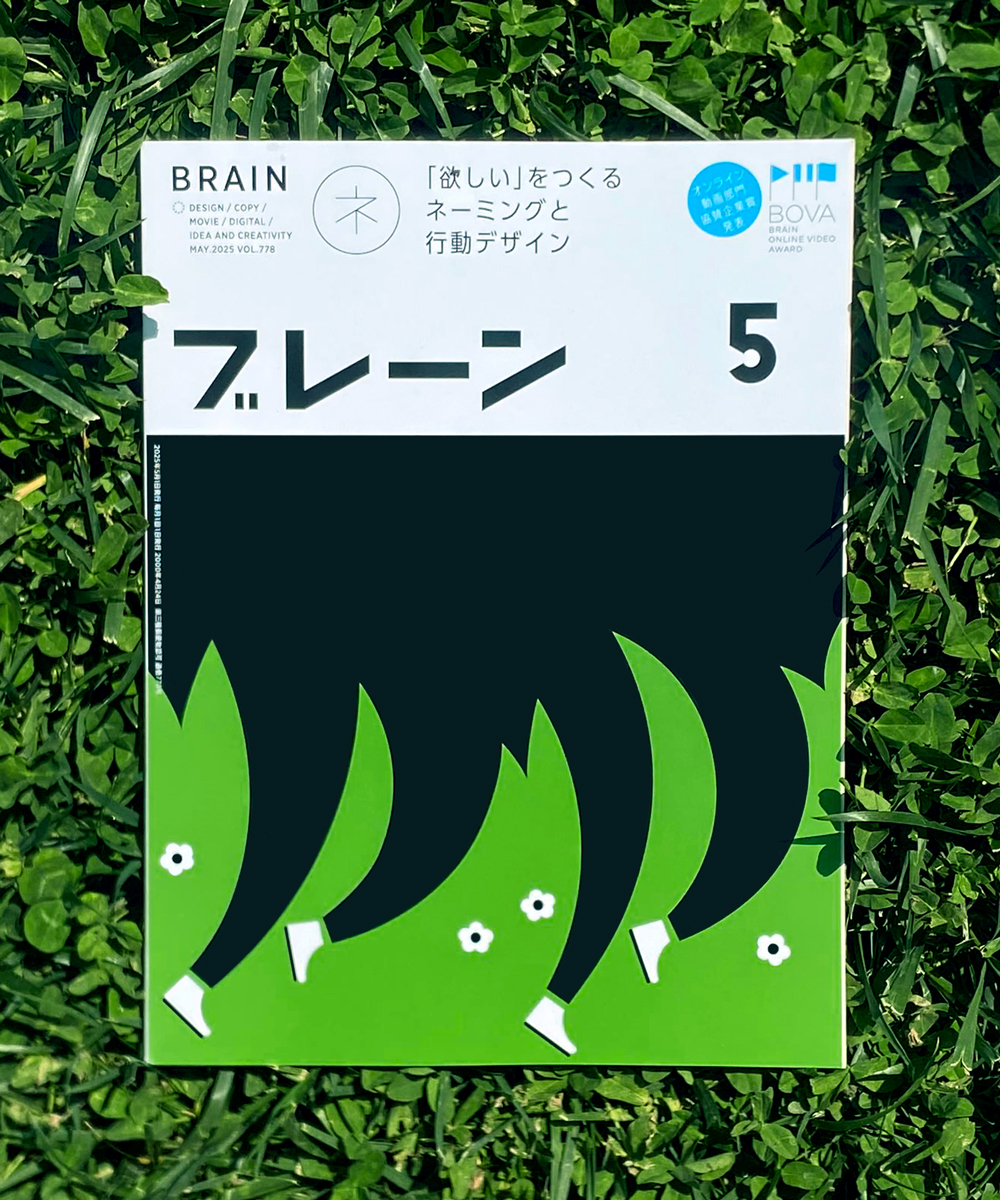
What is the idea for this cover?
“I sought inspiration from the invigorating spirit of spring, using bold signs to emphasize its strength and highlight the theme of nature’s cyclical rebirth, renewal and forward momentum. The composition, merging runners with the environment, aims to reflect the deep harmonious connection between us and the nature we inhabit. This interplay suggests that spring isn’t just about flowers blooming, but also embracing new possibilities and a collective awakening to life’s potential.”
And how did you make it?
“I used a minimal yet “punchy” visual approach, focusing on strong contrasts and simplified forms with the small white flowers adding a delicate touch to the composition, where the figures are cropped dynamically to enhance the sense of movement. I worked digitally, aiming to achieve a balance between abstraction and recognizability in order to create an image that feels both conceptual and expressive.”
What do you think of Japanese advertisements and design?
“I appreciate Japanese advertising for its lateral, often narrative-driven approach. It emphasizes cultural symbols and subtle storytelling rather than relying solely on direct selling, which resonate deeply with me. As an illustrator, I admire the way Japanese design craft unique narratives and visual identity, blending aesthetics with deep cultural meaning. Its ability to tell rich stories with minimalism is something I find both intriguing and inspiring.”


Parents And Children Remain Separated By Miles And Bureaucracygiuliobonasera2022-11-10T17:59:32+01:00